|
|
Case Study: World Trade Centers Association Global Rebrand
Client: World Trade Centers Association (WTCA)
Project Objectives:
The objectives for this project included revitalizing and clarifying the WTCA brand globally and unifying brand communications across the board. In addition, create a new 35th Anniversary logo and corporate materials.
Challenges:
After more than 30 years, the WTCA was well known for its flagship World Trade Center in New York City, but public awareness of the association itself, with more than 270 World Trade Centers worldwide, was almost unkown. Also, the services, branding, and promises of these WTCs varied greatly from place to place. The challenge was to create an updated global brand platform that would be appealing to semi-autonomous WTCs around the world and make a clear statement to the business community and public about the associationíŸÙs purpose.
Process:
Our process included research, brand positioning, messaging, and design. We also held a workshop at the WTCA Congress in Geneva, Switzerland, to encourage World Trade Center license holders across the world to adopt the new brand standards.
Project Results:
The results of this project are far-reaching, as the project covers everything from the core positioning and corporate identity standards to the extensive implementation of branded materials worldwide. Here are a few elements of the implementation of this project.
Messaging
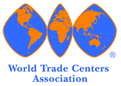
After significant research among WTC members and the public it was decided to focus both the written and visual messaging on the theme "A Global Network of World Trade Centers."

Corporate Identity Standards
WTCA logo circa 1968 |
|
New WTCA logo |
|
|
|
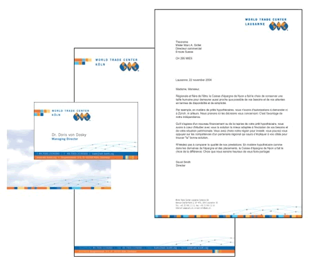
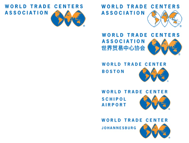
Adaptation of logos for various World Trade Centers
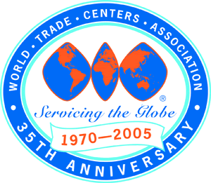
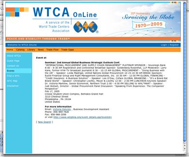
35th Anniversary Logo and Materials
Global Website
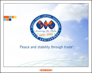
After this campaign had launched, the WTCA website had more than a million visitors per month. With this high level of traffic, we felt this would be a good way to introduce the new theme ퟙA Network of Global World Trade Centersퟘ with a Flash introduction.
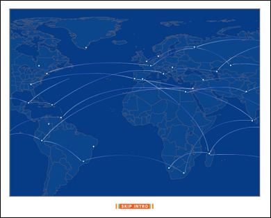
See the Flash Intro here >>
We also designed the interface to the global website.
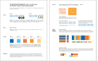
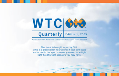
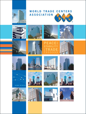
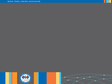
Branded Materials
The elements of the corporate style guide continue to carry the theme of a global network through the multi-colored boxes and network image on a variety of materials.
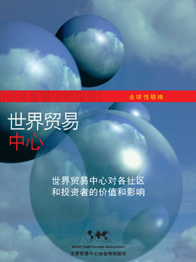
Localization of Materials for China
This case study is featured in A DesigneríŸÙs Research Manual by Jenn and Ken Visocky OíŸÙGrady
See this book at Amazon.com >>
|